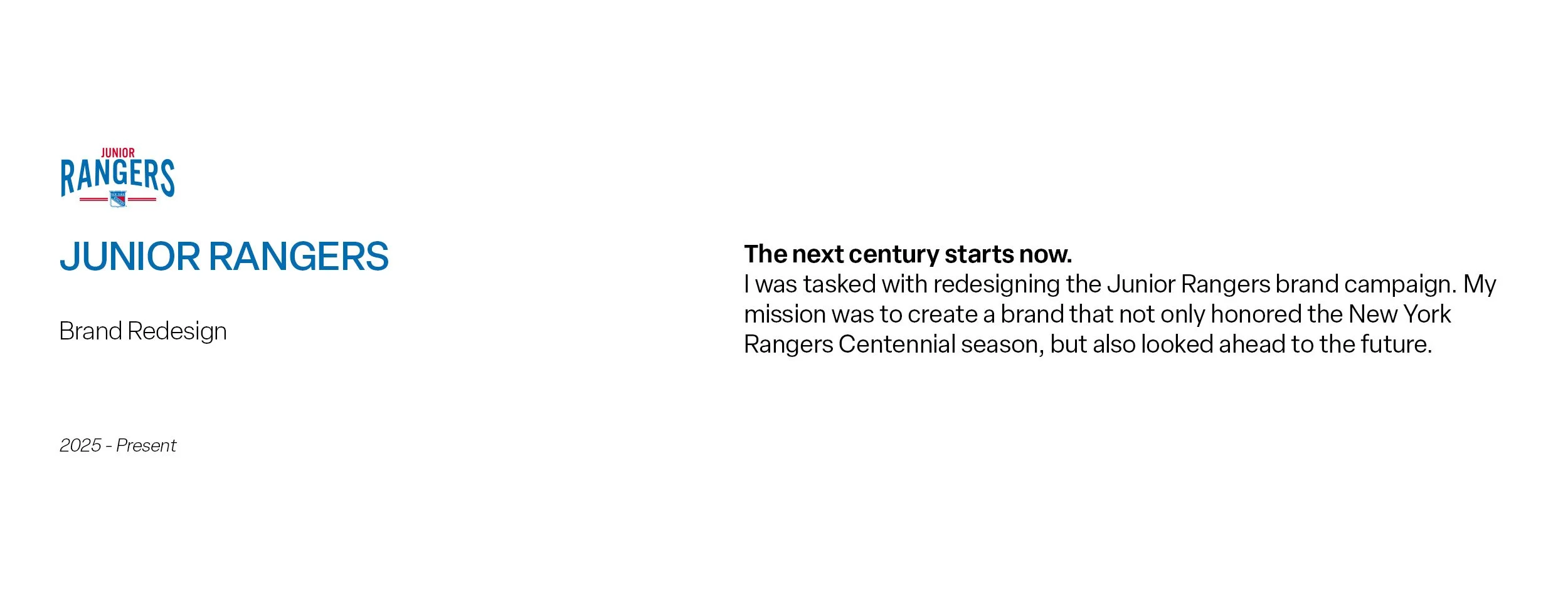
Brief
Create a campaign that honors the past, speaks to the future, and seamlessly blends with the New York Rangers Centennial.

The new primary logo pays homage to the original crest with using the curvature of the old crest in the type and using the old Rangers colorway.
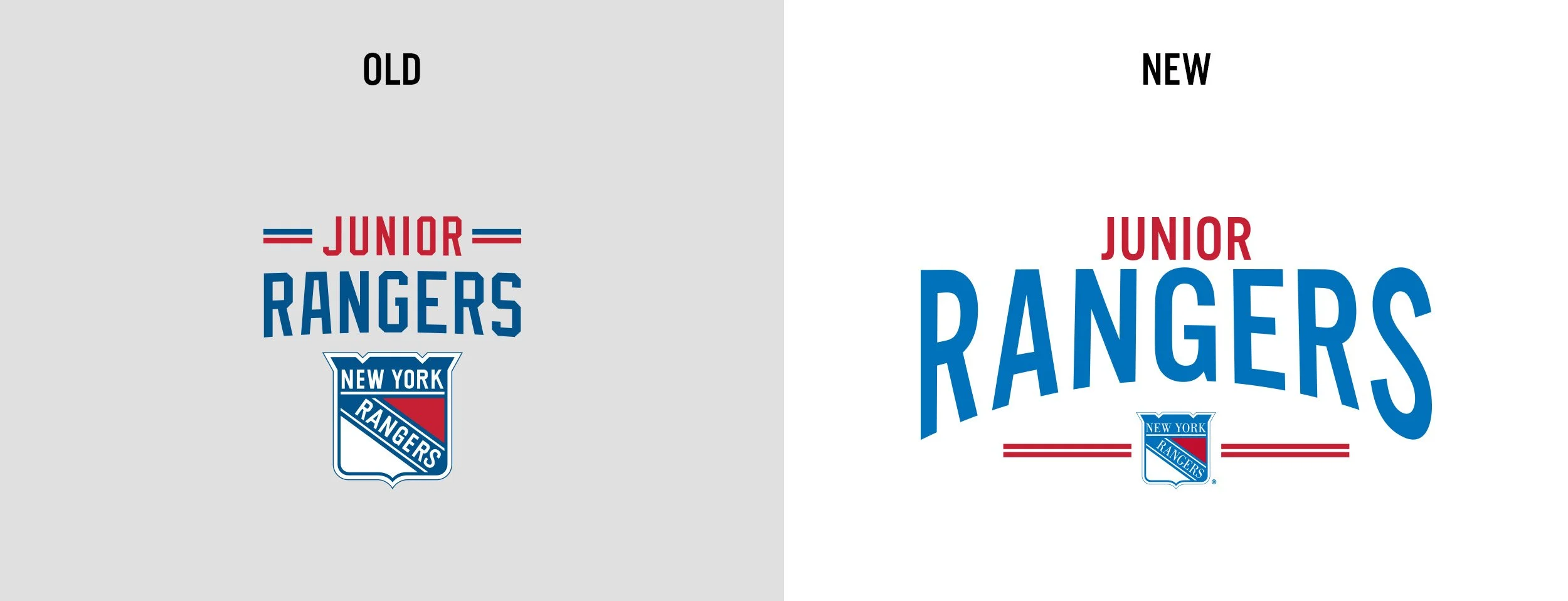
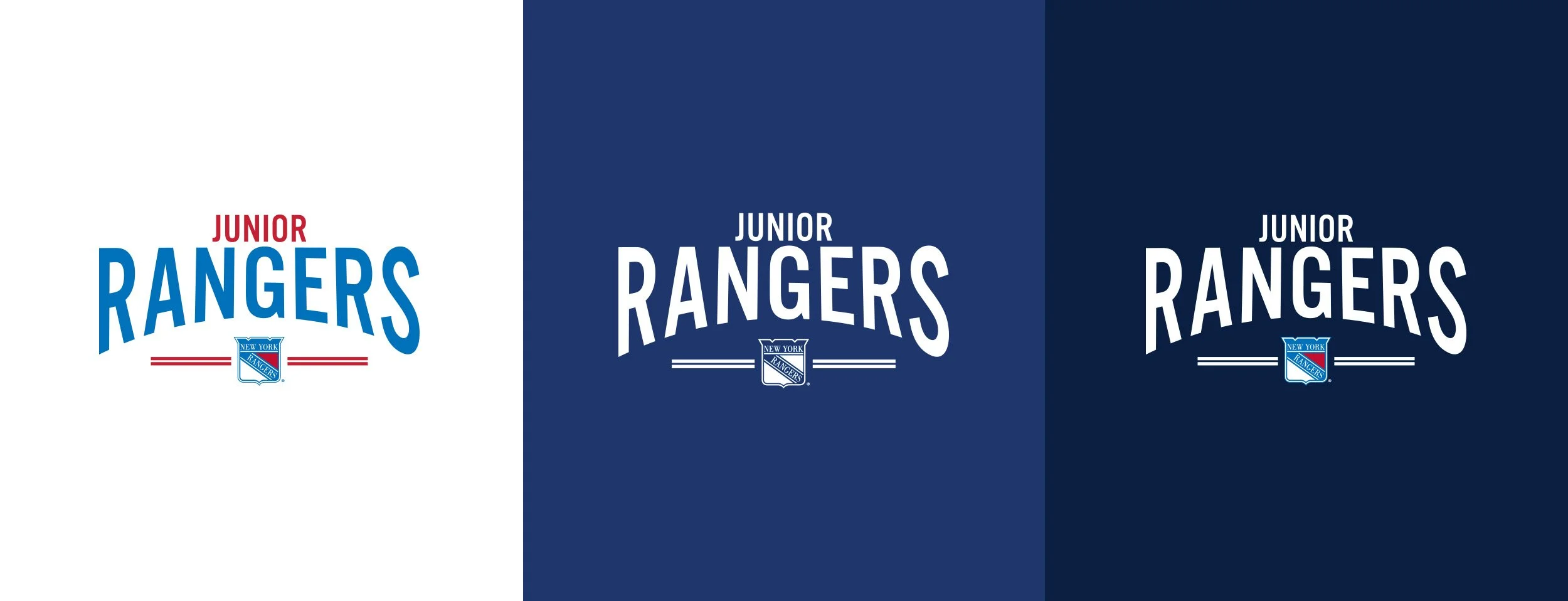
The fonts are the same ones used in the Rangers Centennial Campaign, helping to seamless connect the two brands.

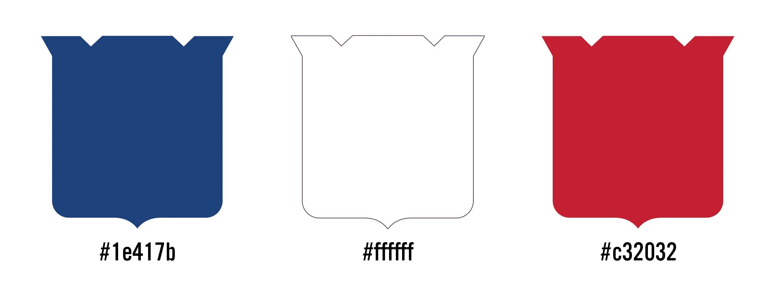
The color palette reflects those of the Rangers Centennial color scheme.
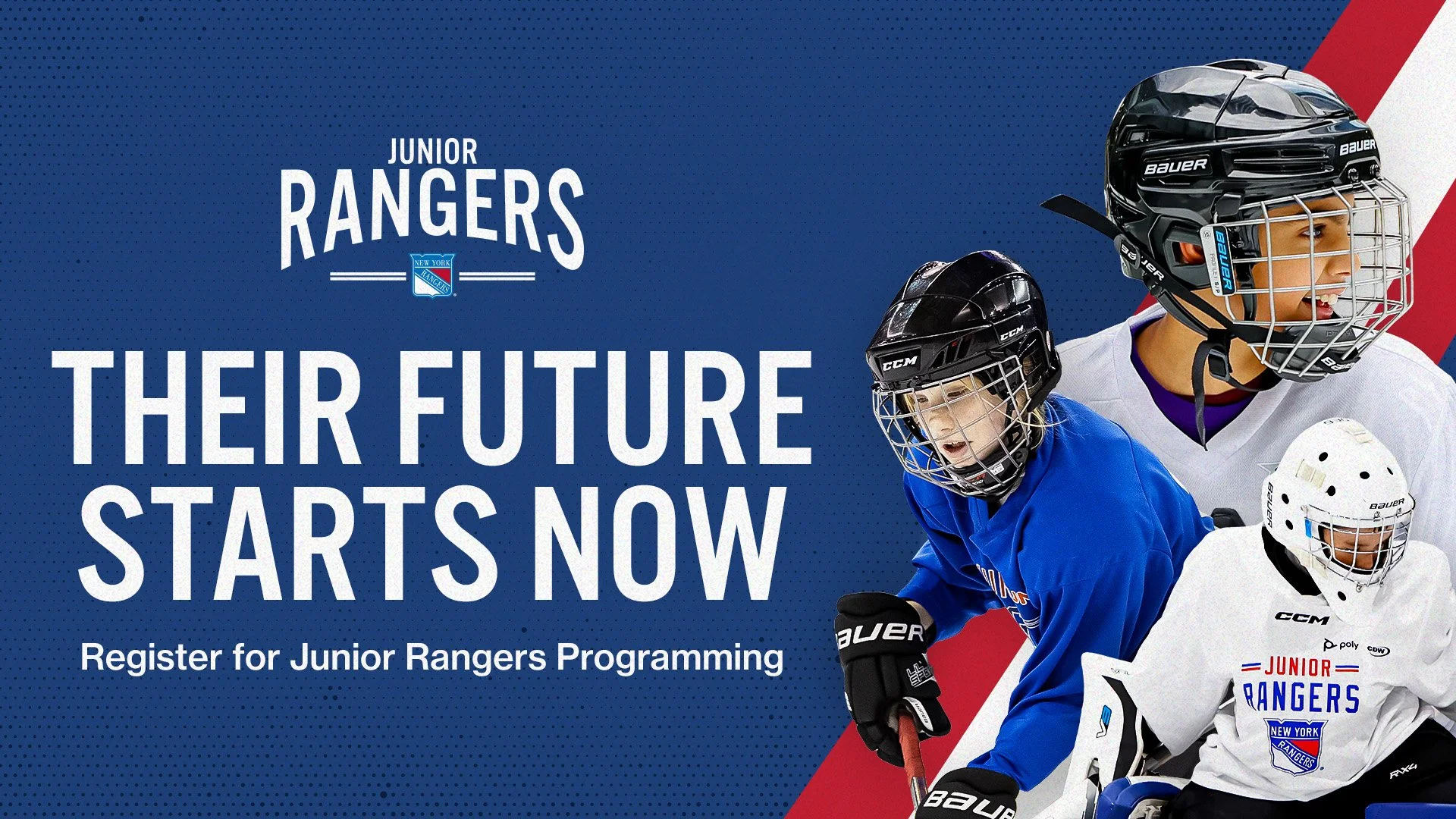
What is the one thing that all the Rangers family has in common throughout the last 100 years? They have all worn the New York Rangers piping proudly, whether that is the kids, the legends, the fans, and everyone in between. throughout the years the names on the jerseys may have changed, however the piping has not. This is the staple of my Junior Rangers redesign. Highlighting what makes this organization special and the memories these lines hold. Each of the three Junior Rangers modes uses the piping to connect the past, present, and future.
Mode 1: uses a line of piping to divide the player from the copy.
Mode 2: has the piping behind player cut outs to greater emphasize our Junior Rangers Players
Mode 3: uses the piping to trace the curvature of the Rangers shield creating a container for photography.
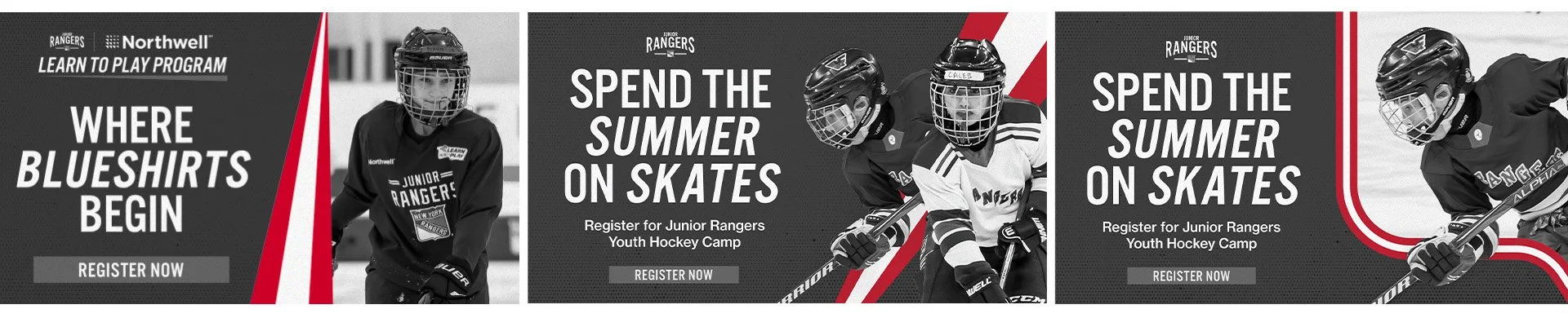
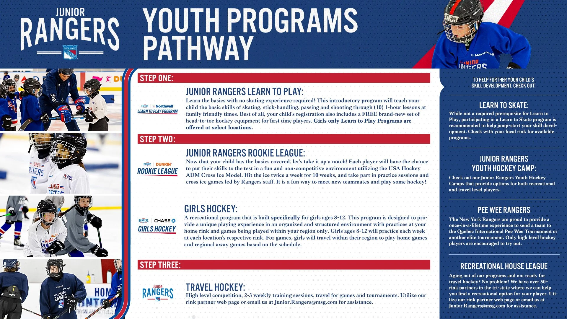
Graphics created throughout the Junior Rangers Season